BRANDING & Logo PACKAGES
I make logos! Beyond the logo packages, I extend branding into stationery and supporting assets (business cards, letterheads) so companies have a consistent, professional presence across every touchpoint.
On this page, you’ll see a collection of some of my past work.

#1
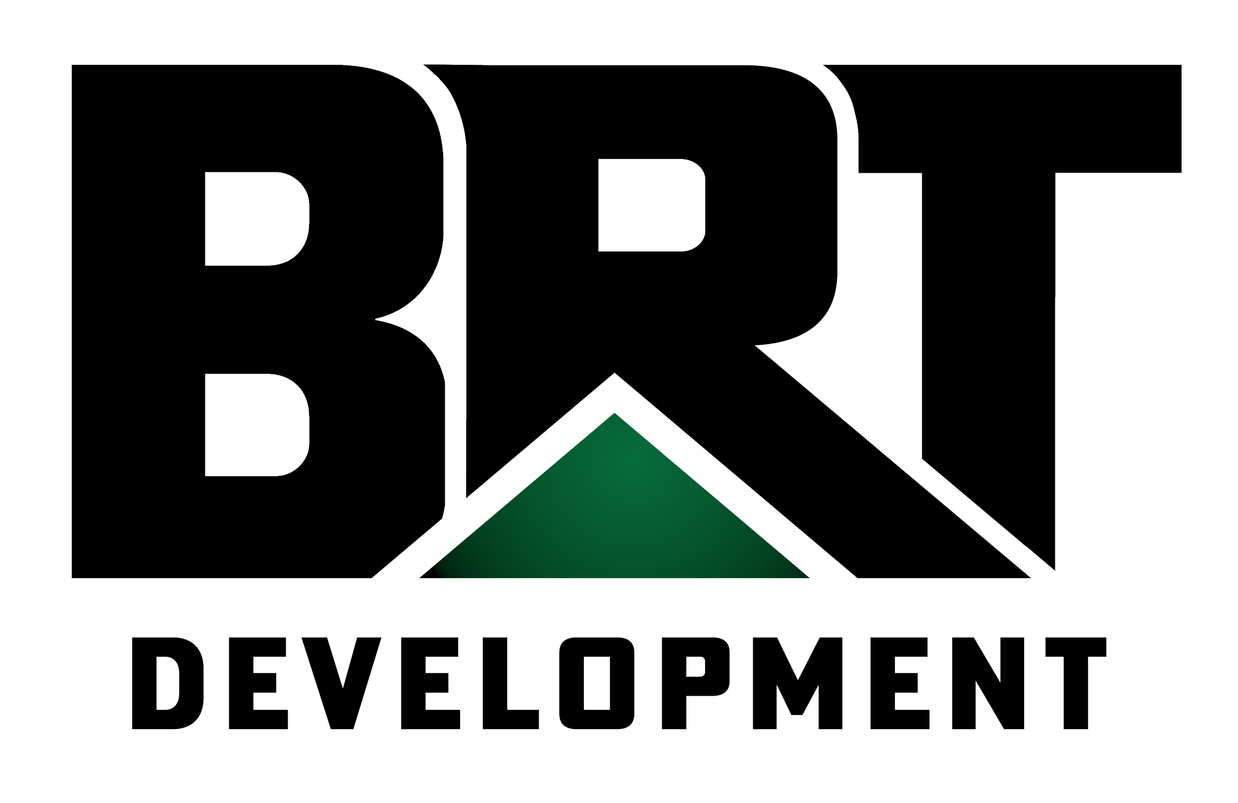
BRT Ventures Branding Package
This dual package was curated for both a real estate parent company, BRT Ventures (investment arm), and its subsidiary, BRT Development (residential construction).
Moon photograph taken with a 600mm lens
The vision behind the BRT Development logo
A house roof is embedded in the "R", which forms a pitched roof by using a design concept called negative space. In geometry, the triangle is the strongest shape, giving the impression of not just a quality builder, but also a strong brand presence
Descriptive Words: Bold, Alpha, Prominent, Strong
The vision behind the BRT Ventures logo
A cube is the fundamental aspect of a home (from building materials to architectural style) and is used in measuring (cubic feet).
Descriptive Words: Structured, Sturdy, Cubic


#2
GSH Ventures BRANDING PROPOSAL
I provided multiple logo prototypes for a new private equity entity. Later, the client chose their favorite logo for the company. For each, I designed multiple color variants to ensure compatibility with any color background, t-shirt, and interface.
The vision behind the GSH Ventures branding
This logo was created to embody boldness and sophistication, with a fluid, interconnected form that reflects both strength and adaptability. The vision was to design something timeless that communicates reliability while still feeling dynamic and modern.
This color scheme consists of shades of blue, chosen to evoke trust, stability, and calm. In branding, blue carries a universal emotional appeal, making people feel confident and secure when engaging with my work.
The brand’s typography (Merriweather and Open Sans) is a classic combination of class and modernness. Three other typography combinations were provided as complementary backups to account for accessibility and font availability.
How I would describe the logo in 5 words: Fluid, Sophisticated, Trustworthy, Timeless, Modern


View the original proposal below
#3
IRONWOOD INSURANCE AGENCY
This logo features a highly memorable symbol: dual two-toned leaves conjoined at their ends. The leaf plays on the word “Ironwood,” which is a type of tree. The wordmark is bold and represents authority, with a quirky leaf as the “i” dot. Together, it reflects a modern approach to branding and insurance. I also provided this client with a color palette, typography guide, letterhead document, and email signature for their brand.
PROTOTYPES
For this client, I created 20 preliminary prototypes. One was selected; from there, another 10 variations were created until we decided on a final.
DELIVERABLES
In total, I delivered approximately 130 files. Each logo has multiple color variations and file types, including:
PNG (72 ppi and 300 ppi)
JPEG (72 ppi and 300 ppi)
SVG
One master Adobe Illustrator file containing everything in one place
Included logo types (approx. 130 files total):
Favicon, Webclip, Open Graph, Box, Horizontal, Vertical

Ironwood logo with a green leaf icon and black text
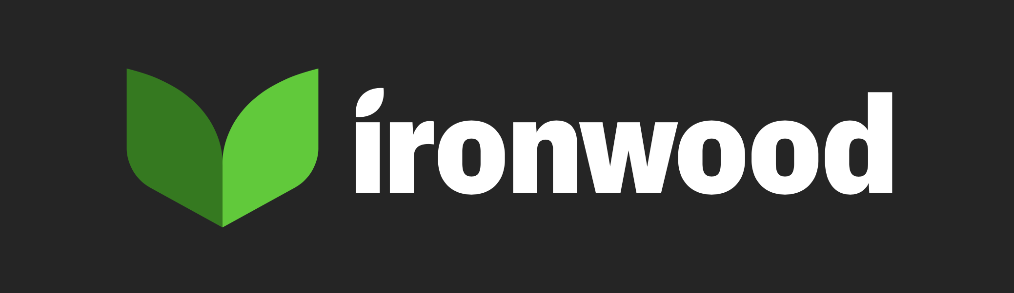
Ironwood logo featuring green and white design on black background
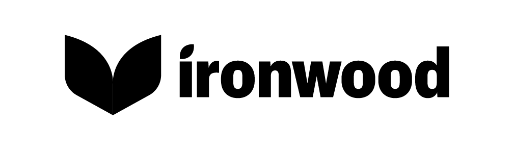
Ironwood logo with a stylized leaf symbol next to the word 'ironwood' in bold black font.
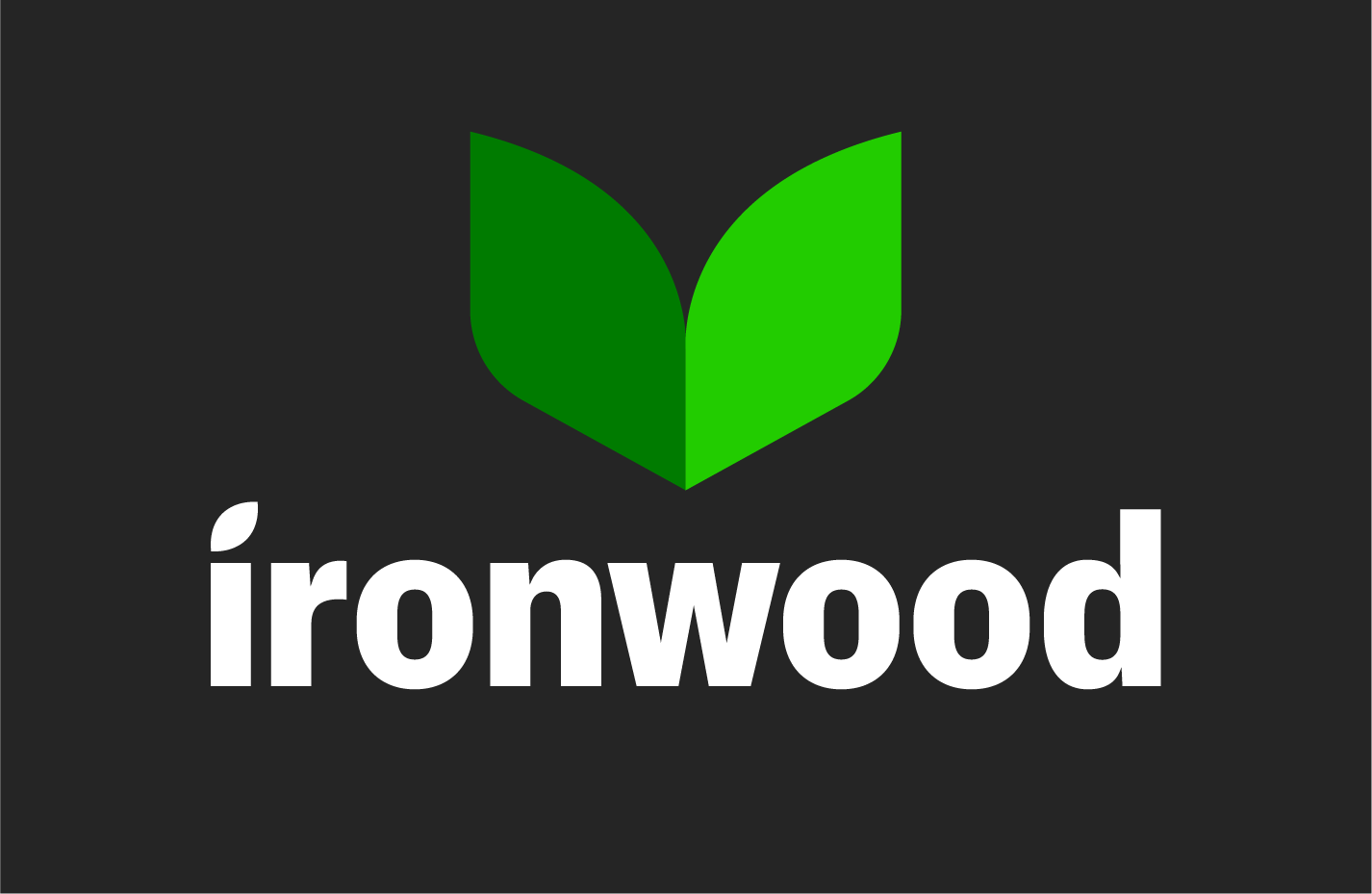
Ironwood logo with a green leaf-shaped icon above the word 'ironwood' in white lowercase letters, on a dark background.

Ironwood logo with a stylized green leaf and the text 'ironwood' underneath.
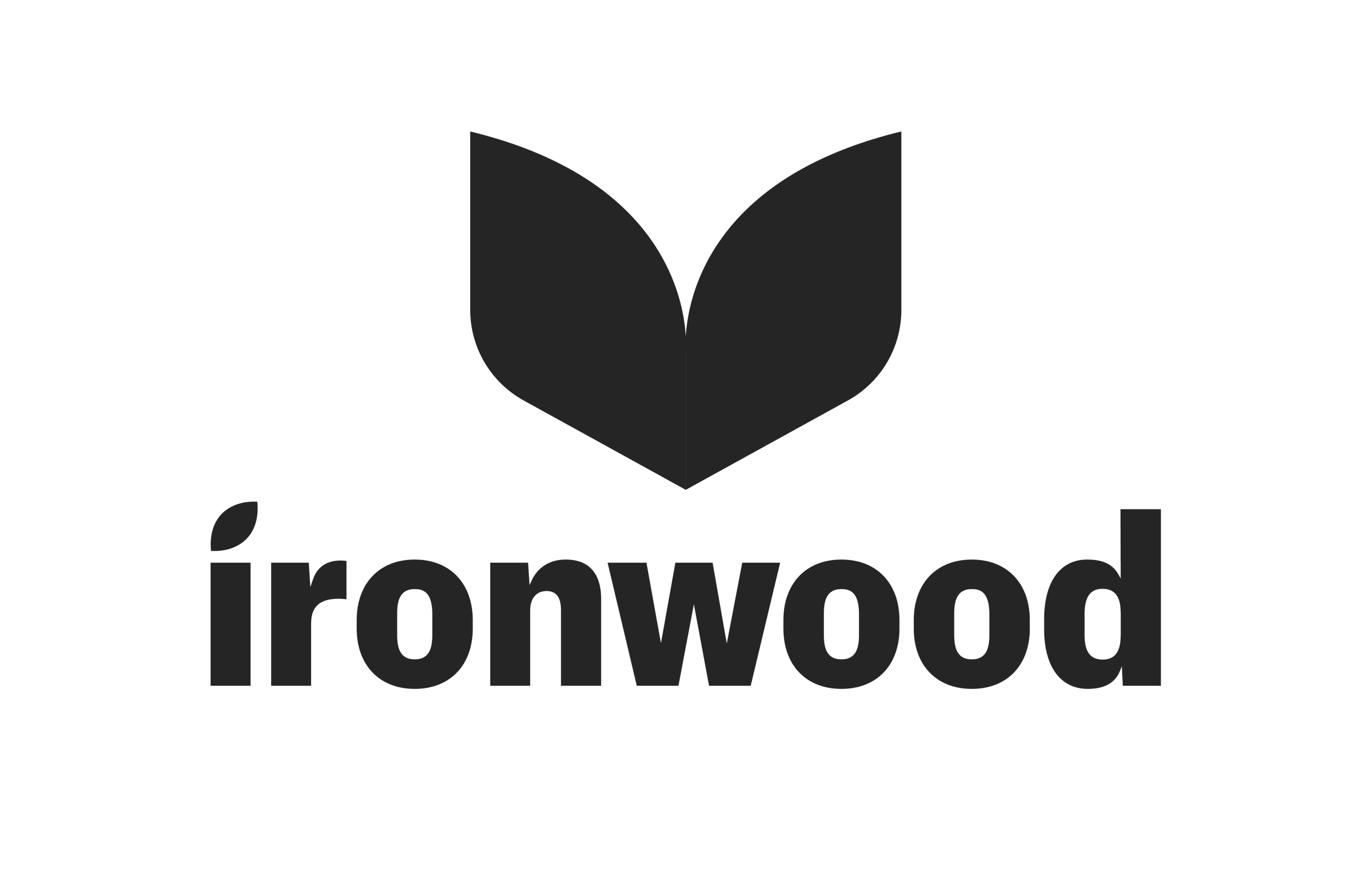
Ironwood logo with a stylized black leaf above the word 'ironwood' in lowercase black letters.
EMAIL SIGNATURE
This minimalistic signature provides all essential business details in the most concise way. The signature is dynamic, meaning everything is hyperlinked (socials, phone, website, address).
LETTERHEAD DOCUMENT
I created a modern, clean letterhead template that tastefully ties into the logo design by subtly integrating the curved leaf shape into the header and footer. All essential business details are provided in the footer.
#4
I’mPOSSIBLE STARTUP CLOTHING BRAND LOGO DESIGNS
A startup clothing brand approached me to design logos inspired by popular brands using their name, I’MPOSSIBLE, a play on words which blends the possible within impossible (I’m possible ≠ impossible).