BRT Ventures Branding Package
This dual package was curated for both a real estate parent company, BRT Ventures (investment arm), and its subsidiary, BRT Development (residential construction).
Moon photograph taken with a 600mm lens
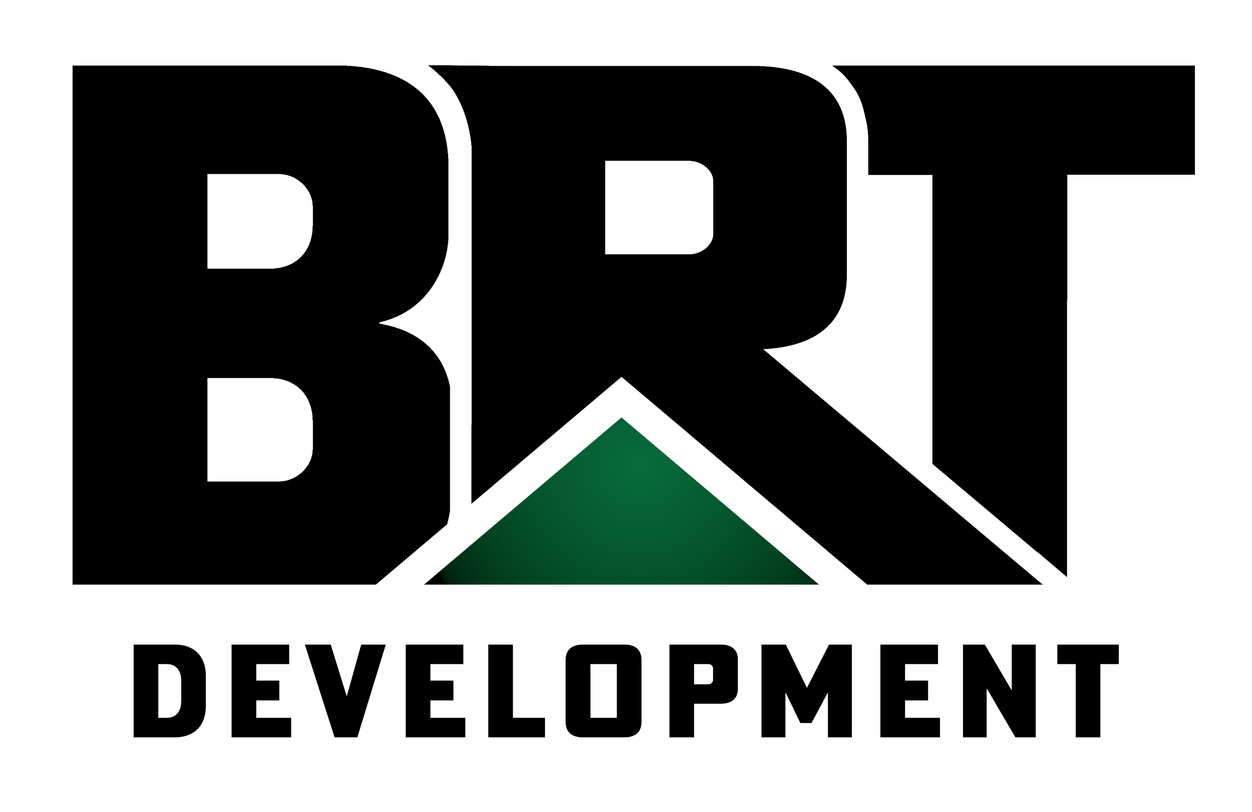
The vision behind the BRT Development logo
A house roof is embedded in the "R", which forms a pitched roof by using a design concept called negative space. In geometry, the triangle is the strongest shape, giving the impression of not just a quality builder, but also a strong brand presence
Descriptive Words: Bold, Alpha, Prominent, Strong
The vision behind the BRT Ventures logo
A cube is the fundamental aspect of a home (from building materials to architectural style) and is used in measuring (cubic feet).
Descriptive Words: Structured, Sturdy, Cubic